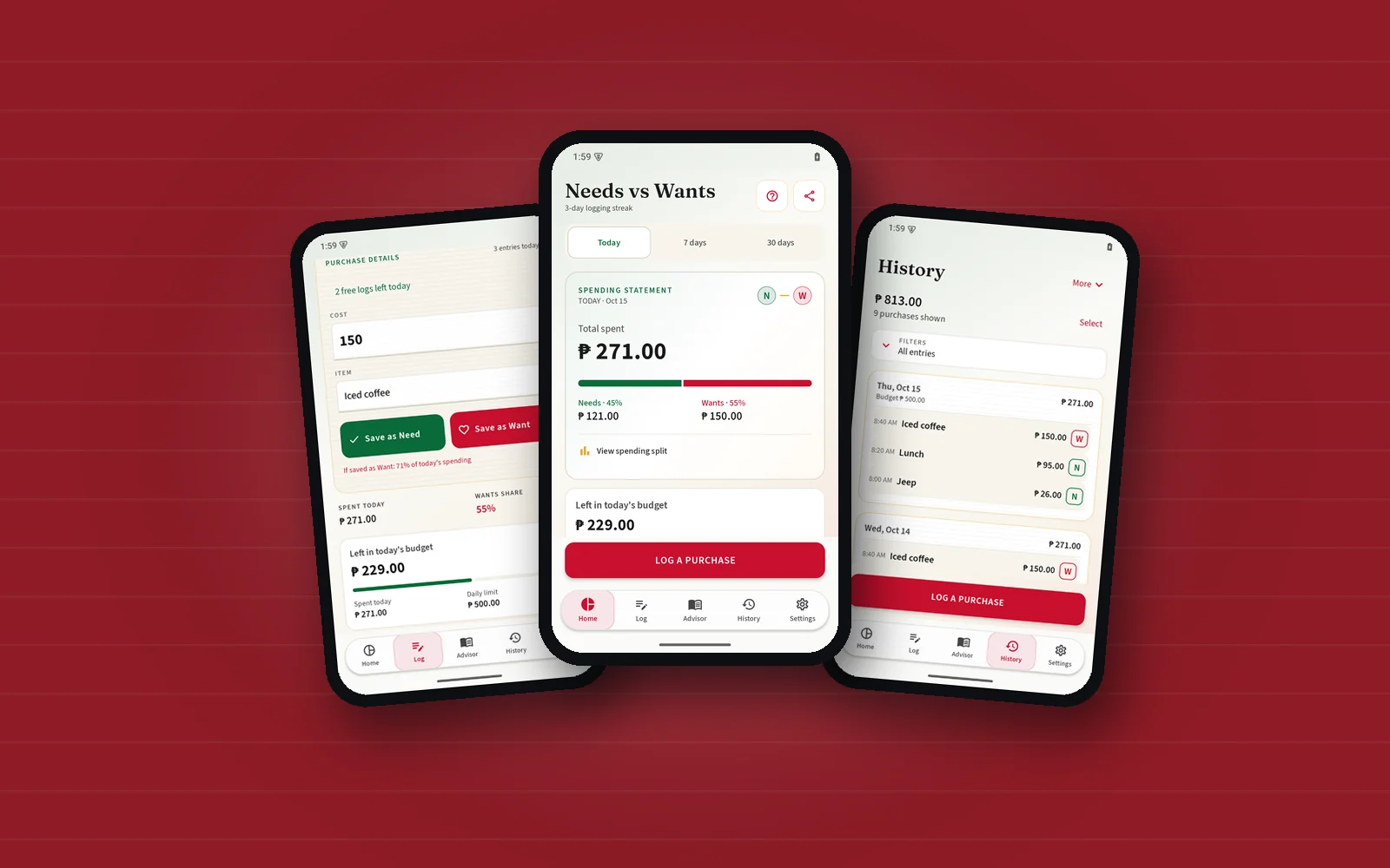

Needs vs. Wants asks for one deliberate choice before a purchase becomes a record: is it a Need or a Want? That small pause is the product. The daily budget and history help a person see what their choices add up to, without turning every entry into an accounting exercise.
I designed and built the native Android app in Kotlin and Jetpack Compose. Green Need, crimson Want, warm paper, and readable ruled rows give it a familiar register-and-notepad character. Motion follows those materials through page changes, stamp feedback, and small control transitions, with a reduced-motion path throughout.
The diary stays on the phone
Room stores purchases locally, with amounts represented as integer cents. A person can start another page without losing the previous one, review history by day, edit a record, and select multiple purchases for an explicit removal. Budget summaries explain the period they describe instead of making a rolling total look like today’s spending.
Backup and restore use Android’s file picker, so the user chooses where their copy lives. Recovery, enlarged text, keyboard access, and clear selected states are everyday requirements for a diary somebody may keep for months.
Guidance beside the decision
An optional online Advisor can help work through a typed question and relevant budget context. The purchase diary remains local. Membership screens explain the available access and restore state without treating a failed refresh as a reason to sell the same access again.
The public website shows real app screens, explains installation and backup, and offers a browser practice flow. App previews, direct downloads, and prepared store bundles have different release steps, so the site identifies what is actually available.
The aim stays specific: make spending visible while the choice is still fresh, then give the person a record they can understand and revisit.